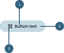
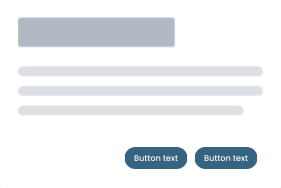
Anatomy
Buttons are fundamental elements in user interfaces, serving as interactive components that
facilitate user actions and engagement.
Buttons typically have a label and can include an icon before or after the label.
-
Label:
Text describing the button action. Use action verbs or phrases to tell the user what will
happen next, and follow the button label content guidelines.
-
Button:
The selectable area of the button.
-
Icon (optional):
Most buttons don’t need an icon. Use an icon to add
additional affordance where the icon has a clear and
well-established meaning.
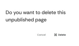
Types of buttons states
Buttons can have different states depending on their use case and the actions they inspire
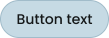
Primary
Most prominent and visually emphasized button.
-
Primary actions, such as submitting a form, completing a purchase, or initiating a critical
user journey.
-
Limited to one or a few primary buttons on a page to
maintain focus.
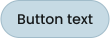
Secondary
Important but less visually prominent button
-
Less visually dominant than the primary button. It is used to represent actions that are
important but not as critical.
-
Secondary actions, like canceling an operation,
navigating to less critical sections, or providing
alternative options.
Tertiary
Least consequential and visually subtlest button
-
Less visually dominant than the secondary button. It is used to represent actions that are not
very important in the design.
-
Tertiary actions include closing a window or cancelling an action
Link
Text button that indicates clicking will lead to an external source or a different area within the
product
-
While typical buttons are actions, links are redirections
Content guidelines
Some basic guidelines to ensure your button usage is coherent and does not break the flow of the
design
Use sentence case capitalization
Only capitalize the first letter of the button and any proper nouns. Most feature names aren't
capitalized or considered proper nouns when following our capitalization guidance.
Do
Keep your button labels clear and concise to help the user better identify the action. The label
should aptly describe the outcome of clicking it.
Don't
Avoid having too many buttons in a single page. Upto one primary button, and four to five
secondary buttons can be considered for the product.
Do
Align buttons to text and form fields on the right side to establish a visual flow for the user.
Don't
Don't scatter buttons around the design. Logically grouping your buttons together can help
reduce the cognitive load on your users.